
Mobile SEO: Top Optimisation Tips to Build a Mobile Friendly Site

Mobile SEO is the practice of optimising your website so that it works beautifully on smartphones and tablets. It ensures your pages load quickly, look great and are easy to use on smaller screens, not just on desktop computers.
With the majority of searches now happening on mobile devices, a strong mobile SEO strategy is one of the most powerful ways to attract visitors, improve your Google rankings and turn traffic into customers.
Why Mobile SEO is Important
Mobile SEO matters because the way people search has changed. More users now browse, shop and search on smartphones than on desktop computers, so a mobile friendly website is essential for reaching your audience, improving your search rankings and growing your business online.
1. More Mobile Users
People increasingly use their phones and tablets to browse the internet, search for products and read content on the go. If your website is not optimised for mobile, you risk losing these visitors to competitors. Because mobile usage continues to grow, a site that performs well on smaller screens is crucial for reaching your target audience.
2. Better Search Rankings
Google and other search engines prioritise mobile friendly websites through mobile first indexing. This means an optimised mobile site is more likely to rank higher in search results. Since so many searches take place on mobile devices, ranking well can drive far more organic traffic to your website. Professional SEO services can help you build and maintain these rankings.
3. Improved User Experience
A mobile friendly site is far easier to navigate on a phone or tablet. When visitors can quickly find what they need and interact with your pages without frustration, they stay longer and engage more. Positive user experiences lead to lower bounce rates, increased traffic and better conversion rates.
4. Competitive Advantage
In today’s digital landscape, a fast, mobile optimised website sets you apart from competitors who have neglected their mobile experience. This gives you a genuine edge in attracting, engaging and retaining visitors across every device.

Tips to Optimise Your Website for Mobile
1. Use Responsive Design
Responsive Design (Recommended)
Responsive design ensures your website automatically adjusts to fit any screen size, from smartphones and tablets to desktop computers. It uses a single URL and codebase, which makes it easier for search engines to crawl and index your site while delivering a seamless experience across every device. This is the approach Google recommends.
Separate Domain or URL Structure (Not Recommended)
Using a separate mobile domain such as m.example.com is not ideal because it creates two versions of your site that must be managed independently. This can cause duplicate content issues, dilute your SEO and make it harder to keep content consistent. For example, desktop: example.com/page and mobile: m.example.com/page.
Dynamic Serving (Not Recommended)
Dynamic serving delivers different HTML to different devices from the same URL. While it can work, it is more complex to maintain and can cause problems if it is not implemented correctly, because it relies on separate device specific code.
2. Optimise Page Speed on Mobile Devices
Mobile users often browse on slower connections than desktop users, so fast loading pages are essential. To improve your mobile page speed, follow these tips:
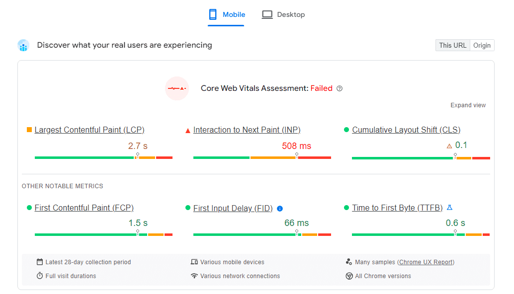
- Compress images: Use image compression tools to reduce file size without losing quality.
- Minimise code: Remove unnecessary code and scripts to speed up loading times.
- Enable browser caching: Store static files in the visitor’s browser so pages do not need to reload every time.
3. Test and Monitor Your Site for Errors
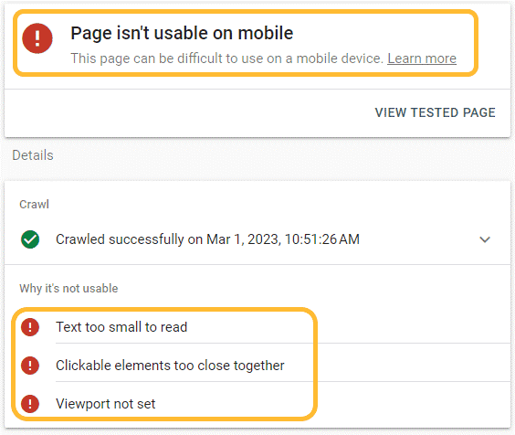
Regularly check your website for errors and issues that could affect performance on mobile devices. Tools like Google Search Console help you identify and fix problems such as broken links, slow loading pages and mobile usability warnings before they harm your rankings.
4. Make Your Content Mobile Friendly
Make sure your content is easy to read and interact with on mobile devices:
- Use larger fonts: Keep text readable without the need to zoom.
- Optimise images and videos: Ensure media scales correctly on smaller screens.
- Simplify layouts: Avoid cluttered layouts that do not display well on mobile devices.
5. Optimise for Mobile Search Results
Search engines favour mobile friendly sites in their results. To improve your mobile rankings:

- Use relevant keywords: Target the keywords and phrases people actually search for on mobile.
- Improve local SEO: Many mobile searches are location based, so optimise for local keywords and include location specific information.
6. Include Mobile Friendly Navigation
Navigation should feel effortless on mobile devices:
- Use simple menus: Avoid complex drop down menus that are awkward to use on small screens.
- Make clickable elements large enough: Buttons and links should be easy to tap without zooming.
7. Keep Your Content Consistent
Keep your content consistent across the desktop and mobile versions of your site. This ensures every visitor receives the same information and experience regardless of the device they use, which also helps your SEO.
8. Avoid Intrusive Interstitials
Intrusive interstitials, such as pop ups that cover your content, frustrate mobile users and lead to higher bounce rates. If you do use pop ups, make sure they are easy to close and never disrupt the browsing experience.
9. Review Mobile Performance
Keep a close eye on how your website performs on mobile devices:
- Check load times: Ensure your pages load quickly on mobile networks.
- Monitor user behaviour: Use tools like Google Analytics to understand how visitors interact with your site on mobile.
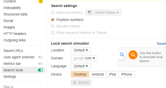
10. Track Rankings on Mobile Devices
Track how your site ranks in mobile search results. This shows you how well your mobile SEO efforts are working and highlights areas to improve. Use dedicated mobile SEO tools to monitor your rankings and make confident, data driven decisions.
Conclusion
Optimising your website for mobile devices is essential for a better user experience and stronger search rankings. By applying these mobile SEO tips, from responsive design and faster page speed to mobile friendly content and navigation, you can reach more visitors and grow your business. If you would like expert help, our SEO services can build a mobile SEO strategy tailored to your goals.